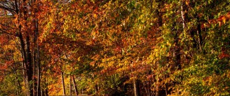
 On Thursday it looked like it was going to be an exceptional weekend for shooting the foliage around here (Bethel, Connecticut, USA). Then it rained on Friday. Not a hard rain, just rain. Well, that about killed it for the fall foliage. By Saturday morning more than half the leaves that had been glowing in the sunlight were gone. Instead of going anywhere (literally anywhere) and having great images jumping out at you a search was required to find something, anything to shoot. Take today’s image as an example. Looks like peak color, right? Turn around and it was almost leafless. There were a few leaves here and there, but nothing to take a picture of. Pointing the camera in the direction of today’s image it was a cat and mouse game, with the sun darting in and out of the clouds. Thirty seconds sooner and all you had was drabness. Thirty seconds later than when the shutter was clicked and you were back to blah. I must be getting either lazy or a little more skillful because this shot never left Adobe Photoshop Lightroom 4 (LR4). That doesn’t mean it wasn’t developed. Since there was no manipulation of the shot (no Cloning, no Healing, no adding or subtracting elements, nothing that could only be done in Adobe Photoshop CS6 (CS6) there was no reason for using CS6. To find out what bits of LR4 were used, hit the “Read More”. The “usual” stuff was done. Clarity, Vibrance, Color Temperature, put a Vignette around it to finish it. The place that was new was in the HSL/Color/B&W panel. If you choose either HSL or Color in the Panel you have two versions of the same thing. Between HSL and Color it looks like Adobe simply did a Pivot Table. Rather than having a Hue page (or a Saturation page or a Luminance page) and all the colors spread out in front of you, you’re presented with each color. Each color has an individual Hue, Saturation and Luminance sliders. Just a different way of looking at the same controls. For today’s image I found it easier to use the Colors subpanel. The only blue in today’s image is in the upper left corner. The sky was pretty much blown out there. Playing with the Blue and Aqua sliders I was able to introduce a touch of blue in that area. I was also able to control (individually) the Red, Orange, Yellow and Green notes. The Adjustment Brush was used in two spots. The first was to bring the road back to looking more like a road rather than a sidewalk. The other was in the lower left corner to deepen the green grass.Today’s image is one of the rare images (for me) where there was no “extra” playing around that could only be done in CS6. Sometimes ya just “get it” in the camera.
Article by The Kayview Gallery. Read entire story here.